dataviz

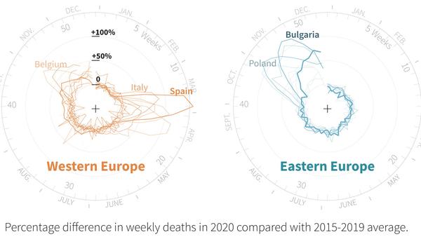
Excess deaths divide Eastern and Western Europe in the coronavirus pandemic
Novel and effective radial line charts
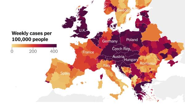
See Where Covid Is Surging Across Europe
Bar charts, line charts and a chilling animated choropleth
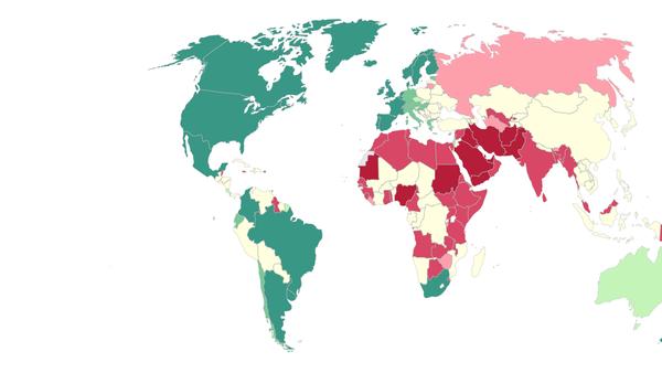
Laws addressing same-sex relationships vary radically across the globe, from full marital recognition to imprisonment and even death. While laws in most affluent, secular countries have shifted in favor of acceptance, many anti-LGBT laws from a colonial past remain in the developing world.
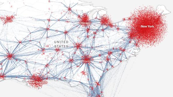
Scrolly map explainer using three.js to render the maps and backgrounds to a canvas element
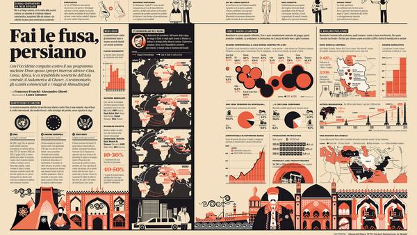
Beautiful infographics, editorial layouts, and news typography


Mass Exodus: The scale of the Rohingya crisis
Visual breakdown of the scale of the exodus of Rohingya refugees

Those Hurricane Maps Don’t Mean What You Think They Mean
Concise exploration of visualizing uncertainty with a “stepper” of video snippets
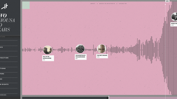
Histography - Timeline of History
Insanely dense and surprisingly intuitive interactive timeline drawn from pretty much everything on Wikipedia.
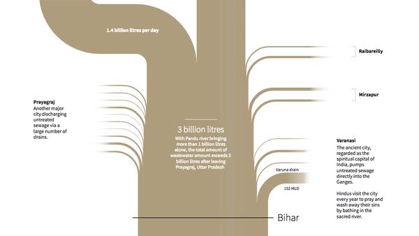
The race to save the river Ganges
Beautiful photography, maps, and hella streamgraph